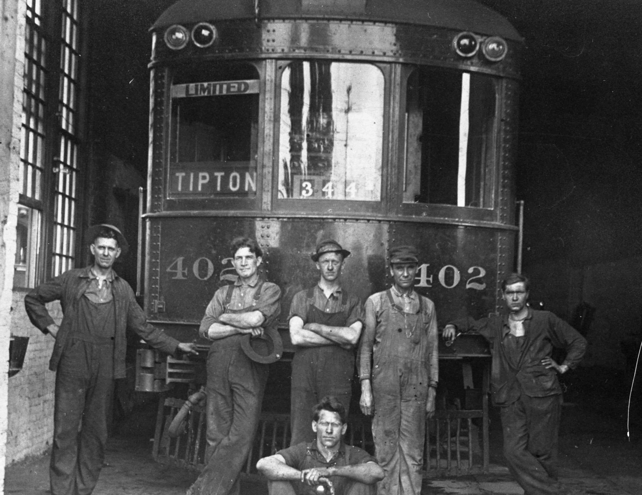
/* Code to control banner animations and fallback for iPad and smartphones. */ /* General rule first - neither video nor fallback display */ #identvideo, #mobilefallback { display:none; } /* Smartphones (portrait and landscape) ----------- */ @media only screen and (min-device-width : 320px) and (max-device-width : 480px) { #identvideo, #mobilefallback { display:none; } } /* iPads (portrait and landscape) ----------- */ @media only screen and (min-device-width : 768px) and (max-device-width : 1024px) { #identvideo { display:none; } #mobilefallback { display:inherit; } } /* computer displays */ /* Desktops and laptops ----------- */ @media only screen and (min-width : 1025px) { #identvideo { display:inherit; } }